buffalo
Brand Concept
Concept Name:
“Strength in Structure”
The visual identity draws inspiration from the name Buffalo, symbolising reliability, resilience, and confidence. This concept is translated into a system that balances technical precision with approachable professionalism.
Visual Identity Elements
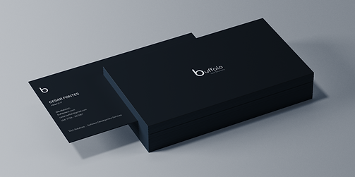
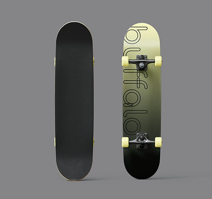
Logo
A bold, geometric logo inspired by the silhouette of a buffalo’s horns, representing strength and security.
Typography
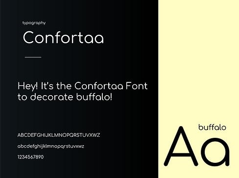
Comfortaa
-
A rounded geometric sans-serif that feels approachable yet structured.
-
Balances buffalo’s technical expertise with a human-friendly tone, making the brand more accessible to clients.Works well across digital interfaces and print applications, ensuring consistency and readability
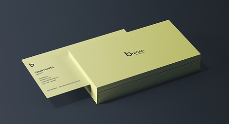
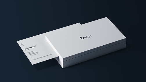
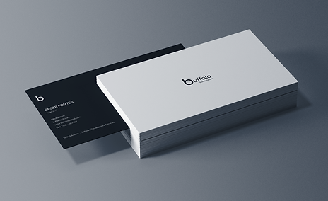
Color Palette -
Pale Yellow (#FFFDB6): Represents innovation, energy, and a welcoming presence. Used as an accent colour for highlights and brand moments that need emphasis.
-
White (#FFFFFF): A clean, minimalist foundation that enhances clarity and reinforces Buffalo’s straightforward approach.
-
Very Dark Blue (#101518): A grounding, professional core colour symbolising trust, stability, and technical reliability. Ideal for primary text, headers, and backgrounds.
Outcome
The rounded geometry of Comfortaa, paired with a dark, trustworthy core palette, communicates buffalo’s technical precision and reliability. The injection of pale yellow ensures the identity doesn’t feel cold or overly corporate; instead, it conveys optimism and forward-thinking innovation.


This is a fake brand and project I made up for the purpose of Portfolio Creation.